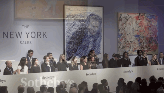
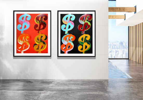
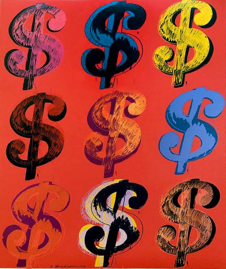
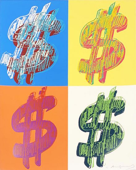
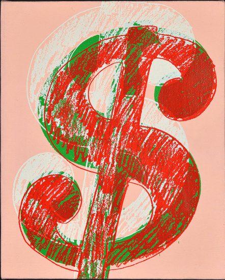
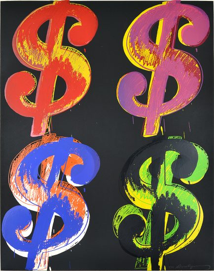
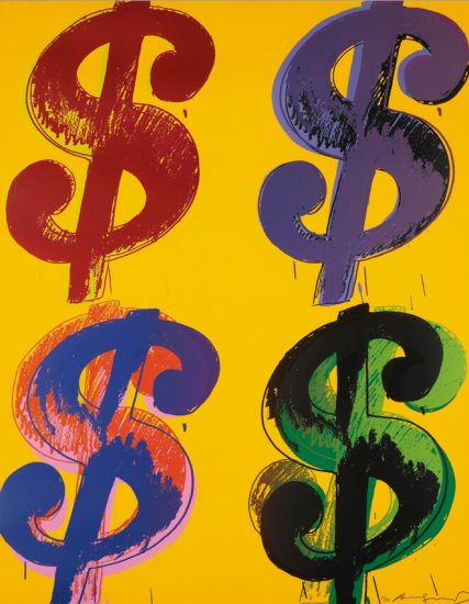
No other series reflect mass identity, luxury, and the value of wealth as prominently as Andy Warhol’s Dollar Sign portfolios from 1982. The prints from this series are recognizable for repeatedly featuring the American dollar sign in neon bright colors. Each reiteration of the image showcases vibrant colors to enhance the visual impact of the monetary symbol and is a unique original work for sale by the pop art icon.
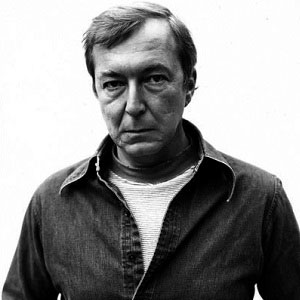
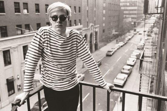
The American artist and filmmaker Andy Warhol was born Andrew Warhola in 1928. There has for years been quite a bit of confusion to where and when Andy Warhol was born, but according to Andy’s two older brothers and the birth certificate that was filed in Pittsburgh in 1945, he was born on August 6th in Pittsburgh. Whether or not this is the day he was born hasn’t been proved, but it was on this date he would celebrate his birthday. However, there is no doubt that he died at 6:31 A.M. on Sunday, February 22nd, 1987, at the New York Hospital after a gallbladder operation. He is considered a founder and major figure of the POP ART movement. A graduate of the Carnegie Institute of Technology in 1949, he moved to New York City and gained success as a commercial artist. He got his first break in August 1949, when Glamour Magazine wanted him to illustrate a feature entitled “Success is a Job in New York”. But by accident the credit read “Drawings by Andy Warhol” and that’s how Andy dropped the “a” in his last name. He continued doing ads and illustrations and by 1955 he was the most successful and imitated commercial artist in New York. In 1960 he produced the first of his paintings depicting enlarged comic strip images – such as Popeye and Superman – initially for use in a window display.
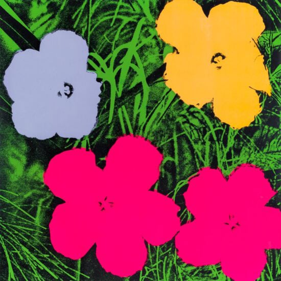
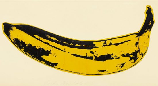
Warhol pioneered the development of the process whereby an enlarged photographic image is transferred to a silk screen that is then placed on a canvas and inked from the back. Each Warhol silkscreen used this technique that enabled him to produce the series of mass-media images – repetitive, yet with slight variations – that he began in 1962. These iconic Andy Warhol prints, incorporating such items as Campbell’s Soup cans, dollar bills, Coca-Cola bottles, flowers, and the faces of celebrities, can be taken as comments on the banality, harshness, and ambiguity of American culture.
Later in the 1960s, Warhol made a series of experimental films dealing with such ideas as time, boredom, and repetition; they include Sleep (1963), Empire (1964), and The Chelsea Girls (1966). In 1965 he started working with a rock band called “The Velvet Underground” formed by Lou Reed and John Cale. Andy introduced them to the model and movie star Nico and she sang on their debut album from 1967 “The Velvet Underground and Nico”. Andy would travel around the country, not only with The Velvets, but also with superstar of the year Edie Sedgwick and the light show “The Exploding Plastic Inevitable”.
On June 3rd, 1968, Valerie Solanis, a rejected superstar, came into The Factory and shot Andy three times in the chest. He was rushed to hospital where he was pronounced dead, but after having his chest cut up and been given heart massage, he survived. Valerie Solanis turned herself in that night and was put in a mental institution. She was later given a three year prison sentence. After recovering Andy Warhol continued to work. He founded inter/VIEW magazine in 1969 (they changed the name to Interview in 1971), published The Philosophy of Andy Warhol: From A to B and Back Again in 1975 and continued to paint portraits until his death in 1987.
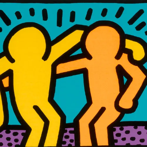
Also browse our collection of Keith Haring pop art.
DOLLAR SIGN
The 1982 Andy Warhol Dollar Sign portfolio is a highly significant body of work that is both a celebration and a satire of the relationship between art, wealth, and the American dream. The pop art icon blatantly acknowledges that money is art, and art is money.
Where Warhol's iconic Campbell's Soup uses the titular consumer product as a metaphor for the critique of consumerism, Dollar Signs brings literal money to the forefront with no distractions; the US dollar sign stands alone. This was especially relevant in 1982 when considering the historical context of a period that embraced the marriage of art and money.
WARHOL SCREEN PRINTS
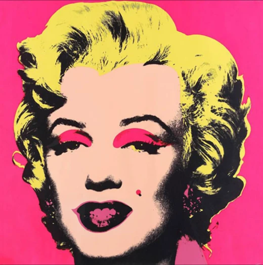
Of his silkscreens, Warhol has said “the reason I’m painting this way is that I want to be a machine, and I feel that whatever I do and do machine-like is what I want to do.” Indeed, machine-like precision and mimicry appear repeatedly in works of this medium. The screenprinting process was a variation of stenciling. Warhol had a streamlined process in producing silk screen prints. First, he laid a photograph on to the mesh of a silk screen. Afterwards, he passed an ink-covered squeegee over the mesh. The ink would pass through the mesh and impress a print of the image onto the canvas underneath. The choice of ink depended on the intended composition of the final product. Warhol was able to apply multiple colors to create a layering effect, thus a different color composition could be made each time. He used a variety of canvases and papers. Warhol’s best known silk screen prints include his iconic portfolio of Marilyn Monroe: Marilyn Monroe (Marilyn), 1967, Elizabeth Taylor (Colored Liz), 1963 and Mick Jagger Portfolio of 10 screenprints, 1975. Producing art in a systematic manner similar to an assembly line, he gave rise to series or portfolios of his beloved celebrities including Andy Warhol's Mao portfolio. Even today, these massively recognizable images serve as a beacon of popular culture.
Warhol’s range as an artist certainly shows in his sculptures and installations. Similar to his other works, his sculptures replicated commercial symbols and ideologies. Of this medium the best known were the series of “grocery carton” works which replicated Heinz Ketchup and Campbell’s tomato juice cans. His best known sculpture from this series is probably his Brillo Boxes,1964. As the name suggests, Warhol applied silkscreened logos of the consumer product onto plywood boxes. The resulting appearance was identical to the logoed boxes often see in supermarkets. These sculptures were first exhibited at the Stable Gallery in 1964 and called to question what can be considered as fine art. When asked about these boxes, Warhol expressed he “wanted something ordinary”. Overall, his sculptural works centered on Warhol’s beloved premise of commercialization.
Enjoy our select collection of Warhol Fine Art.
Browse Andy Warhol Catalogue Raisonnés Online.
En español: Andy Warhol.